Glazey Figma Template: A Developer's Deep Dive and No-Nonsense Review - Free
Glazey Figma Template: A Developer's Deep Dive and No-Nonsense Review
The admin dashboard is the central nervous system of any modern web application. It’s where business happens. Yet, for many development teams, it's an afterthought—a chaotic collection of tables, forms, and buttons cobbled together under tight deadlines. This technical debt accrues interest fast, leading to a brittle UI that’s a nightmare to maintain and a pain for users to navigate. A robust design system isn't a luxury; it's a foundational requirement for building scalable internal tools. This is the promise of pre-built UI kits, and today we’re putting one under the microscope: the Glazey - Professional Clean Modern Admin Dashboard Template Figma. We're not just going to look at the pretty pictures. We're going to tear it down to the studs from a senior developer's perspective, analyzing its structure, component architecture, and true readiness for a real-world project handoff.
Unpacking Glazey: The Initial Setup and First Impressions
There's no installer or complex setup for a Figma template. The process is straightforward: upon acquiring the file, you duplicate it into your own Figma workspace. This gives you a personal, editable copy, leaving the original template untouched. It's the "clone repo" of the design world.
My first action is always to assess the file's structure. How are the pages organized? A well-organized Figma file speaks volumes about the thought process behind the design system. Glazey presents a fairly standard layout. You'll likely find pages like:
-
Cover: The thumbnail and versioning information. Standard practice.
-
Design System / Foundations: This is the heart of the template. It should contain typography, color palettes, grids, and iconography.
-
Components: The library of reusable UI elements like buttons, inputs, modals, etc.
-
App Screens / Pages: Example screens showing how the components come together to form complete layouts (e.g., Dashboard, Users Table, Settings).
Glazey’s initial organization is clean, but could benefit from more granular page separation. For instance, lumping all components onto a single page can become unwieldy in a large-scale project. I’d prefer to see components broken out by category (e.g., "Forms," "Navigation," "Overlays"). This is a minor critique and a five-minute fix for any team, but it's an early indicator of the template's scope. It's built for clarity and speed, not necessarily for sprawling, enterprise-level complexity out of the box.
The "installation" is simple. Duplicate the file, invite your team, and take a moment to click through the pages. Get a feel for the landscape. Before you even think about code, a developer should understand the design language, the constraints, and the building blocks they'll be working with. This initial exploration is a critical step too often skipped in the rush to write code.
Dissecting the Design System: The Good, The Bad, and The Code-Ready
A UI kit is only as good as its underlying design system. Pretty mockups are useless if they aren't backed by a logical, scalable, and developer-friendly foundation. We need to look under the hood at the core elements that dictate consistency and maintainability.
Typography: A Solid, If Unsurprising, Foundation
Glazey uses Poppins, a popular and highly-readable geometric sans-serif font. It's a safe, professional choice that works well for UI text. More importantly, the template correctly defines a typographic scale using Figma's Text Styles. You'll find styles for H1, H2, Body, Caption, and so on. This is non-negotiable for a professional template.
When I evaluate a type system, I'm looking for two things:
-
Clarity: Is the naming convention logical?
Heading/H1ordisplay/largeis far better than "Big Title Text." Glazey’s naming is straightforward and maps easily to HTML tags or CSS classes. -
Completeness: Does it cover all necessary weights and styles? A good system includes regular, medium, and bold weights, at a minimum. Glazey does this well.
However, the scale itself feels a bit conservative. For dashboards with dense data, you might find yourself needing a smaller body size or more distinct heading levels. The good news is that because it’s built on Figma Styles, modifying the entire project's typography is a trivial task. Change the Body/Regular style, and every instance updates instantly. This is the power of a proper design system at work.
Color Palette: Modern and Functional
The color system is another critical pillar. Glazey employs a modern, clean palette with a dominant primary color (a pleasant blue), neutral grays for text and backgrounds, and semantic colors for states (green for success, red for danger, yellow for warning). Crucially, these are all set up as Figma Color Styles.
The naming convention is functional: Primary/500, Gray/900, Success/300. This maps beautifully to modern CSS frameworks like Tailwind CSS, where you work with a pre-defined color scale. A developer seeing Primary/500 in Figma knows immediately to use bg-blue-500 in their code. This one-to-one mapping is a massive accelerator for development.
My main critique here is a potential lack of depth in the semantic palettes. While there's a "Success" green, are there enough shades to handle disabled success states, or subtle success-themed backgrounds? For most projects, what Glazey provides is sufficient. For complex applications that rely heavily on color-coded information, you'll likely need to expand these palettes. Again, because it's built on styles, this is easy to do. You can add a Primary/600 for a hover state, and it becomes available throughout the file.
Accessibility is a key concern. I ran a quick check on the primary button component (white text on a blue background). The contrast ratio is well above the WCAG AA standard. This shows attention to detail, but teams should always perform their own accessibility audits, especially after customizing colors.
Spacing and Grids: The Unsung Hero
This is where many templates fall flat, and where Glazey gets a lot right. The entire design is built on an 8-point grid system. This means that all spacing and element sizes are in multiples of 8px (8, 16, 24, 32, etc.). This enforces visual consistency and rhythm, and it makes a developer's life infinitely easier. There's no more guesswork. The space between a title and a paragraph isn't a random 13px; it's a deliberate 16px or 24px.
Glazey makes extensive use of Figma's Auto Layout. This is the feature that most closely mimics the CSS Flexbox model. Components like buttons, cards, and form fields are built to be responsive within Figma. If you change the text on a button, the padding remains consistent and the button resizes automatically. This is a huge win. It ensures that the design's intent—the spacing rules—is baked directly into the components, not just drawn as static rectangles.
The Component Library: Building Blocks for Your Next Project
The design system provides the rules; the component library provides the Lego bricks. Glazey’s library is comprehensive and covers the essentials needed for most admin dashboards. Let's break down the most critical pieces from a developer's standpoint.
Buttons & Inputs: The Litmus Test
Buttons and form inputs are the most fundamental interactive elements. If a template gets these wrong, it's a major red flag. Glazey's components here are well-constructed using Figma's Variants feature.
For a single Button component, you'll find properties you can toggle in the design panel:
-
Style: Primary, Secondary, Tertiary, Danger
-
State: Default, Hover, Focused, Disabled
-
Size: Small, Medium, Large
-
Icon: True/False (with options for left or right placement)
This is exactly what a developer wants to see. It's a single, robust component that can represent dozens of permutations. In code, this translates directly to a React component: Submit. The properties in Figma mirror the props in code. This alignment between design and development artifacts is the holy grail of UI engineering.
The input fields follow a similar pattern, with variants for different states (default, active, error) and support for icons and labels. The use of Auto Layout means they are flexible and easy to work with.
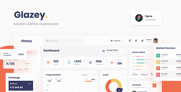
Tables & Data Visualization: The Dashboard's Core
An admin panel is often just a fancy way to display and interact with tables of data. Glazey provides a solid, clean table component. It includes styles for headers, rows (with alternating colors for readability), pagination controls, and action buttons. The components are broken down, so you have a TableCell, TableHeader, etc., which you can assemble into a full table. This is a good approach, promoting composition over rigid, monolithic table structures.
The data visualization part is where things get a bit lighter. The template includes examples of line charts, bar charts, and donuts. These are well-designed and fit the overall aesthetic. However, they are essentially static representations. They are constructed from basic shapes and text, serving as a visual guide for what a chart should look like. This is standard for most Figma templates. A developer will not be exporting these as SVGs; they'll use them as a visual spec to configure a charting library like Chart.js, Recharts, or ApexCharts. The template gives you the visual target; it's up to you to implement the interactive logic.
Atomic Structure and Naming Conventions
Glazey implicitly follows principles of atomic design. You have "atoms" like icons and text styles, "molecules" like buttons and input fields (which are made of atoms), and "organisms" like a search form or a user profile card (made of molecules). The example pages are the final "templates." This structure is intuitive for developers who think in terms of component hierarchies.
The layer naming is generally clean and predictable. A button component might be named components/button/primary. This is good. In the example screens, however, layer naming can sometimes be less rigorous (Frame 1024, Rectangle 58). This is common, as designers often focus on the component library and are less strict with the final mockup pages. As a developer, I mostly care about the component names and their internal structure, which Glazey handles well.
Bridging the Gap: Translating Glazey to React, Vue, or Angular
So, the Figma file is solid. But how does it actually fare during the developer handoff? This is where the rubber meets the road.
Developer Experience and Handoff
Thanks to the rigorous use of Auto Layout, variants, and styles, the developer experience is quite strong. Using Figma's Dev Mode, a developer can click on any component and get useful information. Selecting a button doesn't just show a blue box with a hex code; it shows the color style used (Primary/500), the text style (Body/Medium), and the padding values defined by the Auto Layout (padding: 12px 24px).
The CSS output in Dev Mode is a helpful starting point, providing dimensions, colors, and font properties. For teams using utility-first CSS like Tailwind, the translation is even more direct. That Primary/500 color style becomes bg-blue-500. The 16px of top margin becomes mt-4. The 8pt grid system makes this mapping seamless.
The platform gplpal offers various assets, and while many might search for Free download WordPress themes, the value of a high-quality Figma template like Glazey for a web application is of a different, more foundational nature. It's not a drop-in solution, but a professional blueprint.
Responsiveness: The Elephant in the Room
Here we find Glazey’s most significant weakness. The template is primarily designed for desktop views. While the individual components are built with responsive properties (Auto Layout), there are no fully-realized mobile or tablet page layouts provided. This is a common omission in many Figma templates, but it's a critical one.
This means the responsibility for designing the responsive behavior falls entirely on the development team. How should that complex data table reflow on a mobile screen? Does the sidebar collapse into a hamburger menu? What is the mobile typography scale? The template doesn't provide answers to these questions. A senior team can certainly solve these problems, but it's extra work that could have been specified in the design. For teams with less experienced front-end developers, this could be a major hurdle.
The Verdict: Is Glazey the Right Tool for Your Team?
After a thorough breakdown, a clear picture of Glazey emerges. It is a well-crafted, professional, and highly functional design system for building modern admin dashboards. Its greatest strengths lie in its clean aesthetic and its robust, developer-friendly component architecture. The disciplined use of color styles, text styles, Auto Layout, and component variants makes it a pleasure to work with and translate to code.
It's an excellent choice for:
-
Startups and Small Teams: Who need to build a professional-looking internal tool quickly without getting bogged down in creating a design system from scratch.
-
Solo Developers and Freelancers: It provides a massive head start, allowing them to focus on business logic instead of button padding.
-
Projects with a Desktop-First Focus: Where the primary users will be on laptops or desktops, and mobile responsiveness is a secondary concern or can be handled pragmatically by the dev team.
However, some teams should pause and consider if it's the right fit:
-
Enterprise Teams with Complex Needs: If your application requires dozens of unique chart types, intricate data filtering UIs, and has a very specific brand identity, Glazey is more of a starting point than a complete solution.
-
Mobile-First Product Teams: If your dashboard must provide a flawless experience on mobile from day one, the lack of dedicated mobile designs in this template will create significant extra work.
Final Scorecard
Let's quantify the review with a simple scorecard based on the key areas we've discussed.
-
Aesthetics & UI: 9/10 - Clean, modern, and professional. It looks the part without being overly opinionated.
-
Component Structure & Variants: 9/10 - Excellent use of modern Figma features. The components are robust, flexible, and logically constructed.
-
Design System Organization: 8/10 - Solid foundation with styles for colors, text, and effects. File organization is good, though it could be more granular for very large projects.
-
Developer Handoff Readiness: 8/10 - Strong, thanks to the component structure and naming conventions. The lack of responsive designs is the only major point of friction.
-
Overall Value: 8.5/10 - For its target audience, Glazey provides immense value, dramatically accelerating the design and development process.
Glazey isn't a silver bullet, but it's a sharp, well-made tool that, in the right hands, can significantly accelerate dashboard development. It delivers on its promise of a clean, modern foundation, leaving the complex implementation details where they belong—with the developer. It provides the architectural plans and high-quality materials; it's up to you and your team to build the house.
评论 0