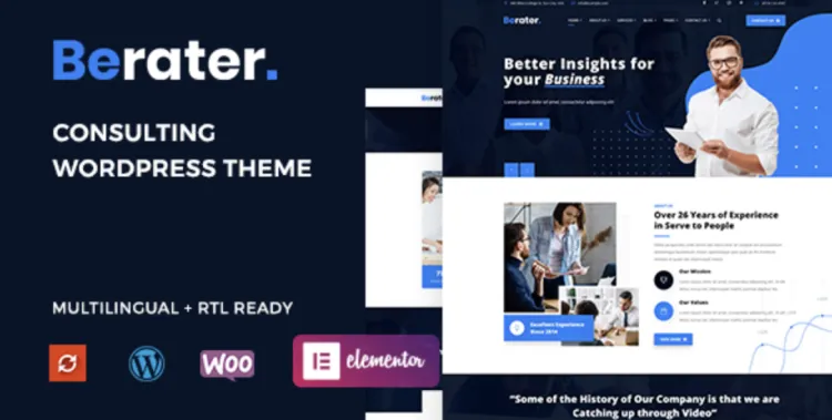
Berater - Consulting WordPress Theme Proven
If you sell advice, your website has one job: make a stranger comfortable enough to start a serious conversation. Not to impress them with buzzwords. Not to parade every framework you know. Just: Is this firm credible, relevant, and easy to brief? When we rebuilt a mid-sized consultancy’s site, we chose Berater – Consulting WordPress Theme for an unglamorous reason—it let us set guardrails that keep editors from drifting into brochure-speak and gave us sturdy page patterns that feel like the bones of a proposal.
The problem most consulting sites share (and how we framed the fix)
Typical symptoms: - A home page that reads like an annual report. - “Services” written as capabilities, not outcomes. - Case studies that hide the numbers and spotlight the logo wall. - A contact form that asks for 12 fields and offers zero context.
Our counter-brief was simple:
1) Lead with who we help and what changes when they hire you.
2) Make every important page skimmable in 10 seconds—on a phone, by an exec between calls.
3) Treat the site like a living proposal: problems, actions, outcomes, next step.
Berater didn’t fight us. It gave us clean sections that beg for specifics—metrics, timeframes, ownership—rather than shiny adjectives.
A home page that earns a call in eight seconds
Above the fold (phone-first):
- One line promise, no decorations: “Reduce underwriting cycle time by 30–40% in one quarter.”
- Subline naming vertical and situation: “For mid-market carriers drowning in manual review.”
- Single primary CTA: “Book a 20-minute scoping call.” No carousel of mysteries.
Immediately below:
- Proof row (three tiles): a number, a brief context, a timeframe.
- “−27% claims cycle time • 6 months • Tier-1 P&C”
- “+18% sales productivity • 90 days • SaaS, 300-rep team”
- “$1.3M opex avoided • FY • Shared services”
Orientation strip (three links, no jargon):
- Problems we fix → short, blunt landing pages
- How we work → engagement model in plain English
- Work → case studies with receipts
The reason it works: Berater’s hero and grid patterns keep the typography and spacing honest. Editors fill in the blanks; they don’t reinvent the layout.
Navigation that mirrors a buyer’s headspace
- Problems (not “Services”): each page named like a real-world headache—“Claims backlog,” “Stalled CRM,” “Onboarding drift.”
- Work: 6–10 case studies, all using one template (Before → Actions → After → Evidence).
- Approach: your delivery playbook in three steps, with risks and mitigations spelled out.
- Team: short bios centered on what you own and what you’ve shipped (not where you interned).
- Insights: one article every two weeks; helpful diagrams beat hot takes.
- Contact: form + calendar. No labyrinth.
Berater keeps the header tidy; mobile nav doesn’t turn into a scroll adventure.
Services the way clients actually buy them
Each service page answers four questions:
1) When is this a good idea?
“You’re shipping but missing targets, or you’re hitting targets but breaking teams.”
2) What do you actually do?
Bullet the actions, not the frameworks: “Interview 12 frontline staff; shadow 3 end-to-end processes; quantify 5 constraint points.”
3) What changes?
Outcomes in sane ranges: “Cycle time −15–30% in 60–90 days; NPS +8–12pts.”
4) What does week one look like?
The calendar: “Day 1 kickoff • Day 3 interviews • Day 5 first map • Day 7 pilot plan.”
We used Berater’s cards and comparison tables to keep the pages consistent. Consistency feels like competence.
Case studies with receipts (not romance)
Template we used across the board:
- Client & context (one line): “Regional health insurer; 1M members; paper-heavy preauth.”
- Before (baseline metric + pain): “Average preauth cycle 12.7 days; 19% rework; 4 FTEs triaging email.”
- Actions (brief): “Digitized 4 entry points; triage rules; routed edge cases; daily huddle for blockers.”
- After (numbers + timeframe): “Cycle 7.4 days (−42%); rework 6%; FTEs redeployed to appeals.”
- Artifacts (assets you can show): flow map, KPI snapshot, comms plan excerpt
- One ugly truth (credibility): “Vendor SSO delayed two weeks—kept pilot scope small; avoided stall.”
The theme’s portfolio layout made this mindlessly repeatable. Buyers read the second one faster because it looks the same as the first.
“How we work” without the fog
Three boxes, one per phase:
- Discover (1–2 weeks): sample deliverables, owner names, expected lift.
- Pilot (4–8 weeks): weekly cadence, criteria to expand, who does what.
- Scale (ongoing): governance, handoffs, training kit, “what we won’t do.”
Include a risk ledger: “Competing priorities, weekend cutovers, spreadsheet dragons”—with your mitigation moves. Grown-ups hire grown-ups.
Team page: why “who” matters in consulting
We cut the conference-photo collage and wrote bios as commitments:
- “I own data analysis and will send you signal by Day 5.”
- “I script and lead the executive read-out; you see zero slide thrash.”
- “I interview frontline staff; I protect their time and their candor.”
Berater’s people grid is understated, which is precisely what you want when your credibility is the content.
The small design system that keeps you out of trouble
- Type: one sans, two weights. Big enough to read on a train.
- Spacing: 8-point rhythm. Every section breathes, nothing clumps.
- Color: one primary, one accent for data, neutral backgrounds. Avoid the “five blues” trap.
- Motion: no parallax, no bouncy entrances; respect reduced-motion preferences.
Set it once; protect it fiercely. Berater honors decisions if you make them early.
Conversion without theatrics
Forms: four fields max. Name, work email, company, topic.
Calendar: embed a 20-minute slot picker. Default to your quiet hours.
“After submit”: show the playbook—“What happens next: we read, we check we’re a fit, we reply within one business day with either a suggested path or a referral.”
Pricing: publish ballparks or engagement models. People don’t fear numbers; they fear surprises.
A site that says “we’re organized” converts better than a site that shouts “we’re visionary.”
Words that pull weight (steal these)
- CTA (home): “Talk to an engagement lead”
- Subline: “No sales deck. A quick brief and a plan.”
- Service opener: “When this hurts”
- Risk header: “What goes wrong, how we prevent it”
- Case study aside: “What failed in pilot (and why it didn’t sink the project)”
- Footer note: “We don’t add you to a newsletter because you asked a question.”
Your copy is a handshake. Make it firm and short.
Speed, structure, and search (the unsexy moat)
- Speed targets: LCP < 2.5s, INP < 200ms, CLS ~ 0.00 on phone.
- Structure: one H1 per page; H2s for sections buyers expect—Problem, Actions, Outcomes, Next steps.
- Internal links: Problems → Work → Contact. Keep loops tight; don’t strand pages.
- Metadata: titles that read like helpful answers, not slogans.
Berater loads light if you respect image sizes and avoid the third-party script carnival.
A two-week plan you can actually follow
Day 1 — Lock type/spacing/colors; sketch IA on a whiteboard.
Day 2 — Write the home hero, proof row, and three “Problems we fix.”
Day 3 — Build home from real copy. No lorem allowed.
Day 4 — Draft two service pages and one case study with numbers.
Day 5 — Wire “Contact” with a calendar and a four-field form.
Day 6 — Ship “How we work” with risks/mitigations.
Day 7 — Performance pass: cap images, preload fonts, lazy-load below the fold.
Day 8 — Accessibility pass: focus states, contrast, keyboard through forms.
Day 9 — Add two more cases; standardize the template.
Day 10 — Write one useful article (diagram > essay).
Day 11 — Legal & privacy review; publish your data and cookie stance in human language.
Day 12 — Stakeholder walkthrough; cut 20% of words.
Day 13 — Soft launch to 15 friendlies; fix top five issues.
Day 14 — Go live. Announce once. Then let the site do its job.
A theme can’t give you discipline, but it can reward it. Berater does.
FAQ from the CFO/COO crowd (and answers that calm them)
“Will this distract teams?”
No. Most of the work is writing what we already do into patterns a buyer can skim. Editors work in pre-built sections; there’s no open-ended “website project” dragging on.
“How will we measure success?”
Two numbers: qualified calls booked per week and time-to-first-response. If they don’t move, we fix pages, not buy ads.
“What about hiring?”
Your Team and Insights pages double as recruiting material. Candidates who read them interview better and onboard faster.
“Do we need a blog?”
You need artifacts buyers can cite inside their company. A monthly diagram beats a weekly think piece.
The quiet advantage of getting sourcing right
We like low-drama releases: staging and production stay in lockstep, updates happen on purpose, and rollbacks are painless. A curated catalog such as gplpal helps keep plugin/theme versions predictable so your site feels like an operations asset, not a science experiment.
Final word: sell the change, show the proof, make the next step easy
Consulting buyers are busy. They will not hunt for your point. They will not decode your jargon. They will reward clarity, numbers, and an honest next step. Berater – Consulting WordPress Theme won’t write your substance; it will discipline your presentation so the substance lands. Make pages that read like proposals, show receipts, publish your playbook, and give them a button that respects their time.
You don’t need a new brand manifesto. You need a site that behaves like your best project manager.
评论 0