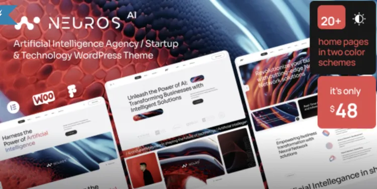
Craft Notes from a Studio Build with “Neuros – AI Agency & Technology WordPress Theme”
Every AI shop I’ve worked with has the same split personality: half of the team wants the site to read like a peer-reviewed paper; the other half wants a cinematic product reveal with glowing particles and synths. Somewhere in the middle is where paying customers live. That’s why I keep coming back to Neuros—it’s an AI Agency-calibrated WordPress Theme that lets you frame a clear business story without wrestling the CMS every time someone renames a model. If you just want the cliff notes: neuros theme wordpress features gives you enough structure to launch fast and enough flexibility to grow when your positioning shifts.
The brief I give new AI clients (and why Neuros fits it)
- You’re not selling models; you’re selling outcomes. “Cut underwriting time by 39%” beats “state-of-the-art embeddings.”
- Proof travels farther than adjectives. Case tiles with numbers, screenshots with context, and a simple “Before/After” beat a 2-minute sizzle reel.
- Speed is a feature. If your hero image drags, your credibility lags.
- Editors will change the site at 6:45 p.m. on a Friday. They need guardrails, not a design degree.
Neuros ships with an opinionated component set that almost forces those truths: hero patterns that say “what it is” in one line, section blocks that expect a real metric, and project detail pages that won’t let you hide behind buzzwords.
A page that earns trust in 8 seconds
Above the fold (mobile first):
- Clear promise, one sentence.
- Secondary line that names a vertical (“for insurers,” “for logistics,” “for retail ops”).
- A single CTA: Talk to an engineer or See a demo—pick one.
What the eye hits next:
- Three proof tiles — Metric → Context → Source. “-27% claims cycle time • 6 months • Tier-1 carrier.”
- A credibility row — customer logos if you have them; otherwise, category badges (“SOC2,” “HIPAA,” “ISO 27001”).
- An explainer slice — 4 steps with plain language (“Collect → Clean → Decide → Monitor”). No swirling planets.
Neuros helps here because the hero, proof grid, and explainer slices are patterns—not blank canvases. You fill the slots; you don’t reinvent the wheel.
What I lock on day one (tokens, not vibes)
- Type scale: One sans, two weights; H1 36–40 on desktop, body 16–18 with generous line-height.
- Color roles: Primary (links/CTA), Surface (cards), Neutral (copy), Status (success/warn/danger). “Brand blue” doesn’t need ten cousins.
- Spacing: 8-point rhythm so cards don’t drift.
- Motion: Subtle opacity and 8–12px translates; nothing rotates, nothing bounces, nothing flips.
Set these once in Neuros’s customizer and the whole theme obeys. Your editors can’t knock the layout off its rails by adding one more paragraph or a second logo.
The three pages AI buyers actually read
1) The Solutions page (not “Platform”)
Replace high-level architecture diagrams with concise “jobs to be done.” For each job, I use a repeatable Neuros card:
- Job: “Detect duplicate claims before payout.”
- How it works: “Cross-carrier graph + sequence model.”
- What you get: “Flag rate 1.7%, precision 88%.”
- CTA: “See it on real data.”
This is where “Neuros” earns its name: it nudges you to turn tech into decisions.
2) The Case Study page
Talk like a project manager:
- Before (pain + baseline metric).
- After (metric change + timeframe).
- What failed during pilot (one honest hiccup—realism builds trust).
- Stack (enough detail to show you didn’t sprinkle AI dust).
Neuros’s portfolio templates were clearly designed by someone who has shipped real projects; they prioritize the narrative blocks you need.
3) The Pricing / Engagement page
If you sell projects, say “Discovery → Pilot → Rollout” with a typical calendar and a ballpark. The theme’s comparison tables are gentle on the eyes—use them to separate tiers or phases without screaming “paywall.”
The demo that doesn’t embarrass your engineers
A lot of AI sites push folks to a contact form. You’ll book more serious calls if you add a demo hub:
- Live walkthrough: ten minutes, pre-recorded, captioned.
- Interactive toy: upload a small CSV, get a sample analysis (or a mock).
- API snippet: show exactly one request/response pair with plain-English comments.
Neuros’s code block styling is clean. If you paste a request, it looks like a grown-up wrote it, not a screenshot from a code playground.
“Do we need a blog?” (Yes—if you commit to this cadence)
- Twice a month: Field Notes—something you tried that worked or failed (one chart).
- Once a month: Customer Story—shorter than a case study, more personal than a press release.
- Quarterly: State of the Stack—what changed in your infra and why (keeps recruiters, partners, and buyers aligned).
If you can’t keep that rhythm, ship a Docs page instead with “How we evaluate data,” “Monitoring drift,” and “Security posture.” Neuros’s article templates read like real documents when you skip the marketing confetti.
Navigation that mirrors how people decide
Top-level items I’ve found convert best:
- Solutions (jobs to be done).
- Work (cases/portfolio).
- Why us (principles, security, compliance).
- Docs (how we work; doubles as a blog if you’re short on marketing).
- Contact (short form, calendar, and a real email).
Neuros’s header can stay sticky without hogging space, and the mobile menu tucks away cleanly. If you set a 48px tap target, you’ll stop mis-taps that make your bounce rate look like radio static.
Performance budgets (because “AI” shouldn’t mean “slow”)
Targets I enforce on every build:
- LCP < 2.5 s on a mid-tier phone over spotty coffee-shop Wi-Fi.
- INP < 200 ms (forms feel instant).
- CLS ≈ 0.00 (cards don’t jump).
How I keep them:
- Reserve image ratios on every card.
- Self-host one primary font, two weights.
- Lazy-load video and 3D animations below the fold—if you must have them.
- Inline critical CSS for hero sections; defer everything else.
Neuros helps because it doesn’t fight you: no surprise “always on” sliders, no 20k-line CSS mystery.
Credibility without peacocking
- Certifications get their own slice with one-line explanations (“SOC2 Type II—audited annually”).
- Security deserves its own page: encryption, retention, incident process.
- Humans on the team: two-sentence bios, one thing each person owns.
- Careers: post roles you will actually fill; link the “How we interview” doc. The best candidates arrive better prepared, and the rest self-select out.
Neuros’s people grid and job listing components are humble (a compliment). They won’t overshadow the work.
AI Agency homepages that actually convert (three starting recipes)
Recipe A — “We fix a specific expensive problem”
- Hero: “Cut chargeback review time by 40%.”
- Proof row: three tiles with numbers, not adjectives.
- Explainer: 4-step flow with small icons.
- Case slice: one story with a chart.
- CTA: “Talk to an engineer.”
Recipe B — “Platform + services”
- Hero: “A decision layer for operations teams.”
- Feature row: small illustrations + two-line benefits.
- Industry tabs: logistics, finance, retail (swap in relevant screenshots).
- Community slice: Docs, API, and a “Changelog.”
- CTA: “See the live demo.”
Recipe C — “Lab to market”
- Hero: “Research to revenue in 90 days.”
- Timeline: idea → prototype → pilot → rollout, with real durations.
- Portfolio: three projects, one failure story (yes, it helps).
- Team: who’s who, with one sentence each.
- CTA: “Book an office hour.”
Neuros contains blocks for all of these out of the box; you’re not duct taping layouts.
Content your sales team will reuse (steal these)
- Call opener: “We make your ops team stop guessing and start deciding with the data you already own.”
- One-liner for security people: “We default to collection-minimization and human-in-the-loop.”
- Email PS: “Here’s a 90-second walkthrough—no music, just the screens.”
- Demo disclaimer: “The data below is synthetic; timelines and outcomes reflect production projects.”
Put them into reusable Neuros components; your reps will use them instead of rewriting from scratch.
The one-day workshop I run for AI agencies
Morning
- Positioning: write a 10-word promise customers would pay to test.
- Narrative: Before → After → Why you (three bullets each).
- IA on a whiteboard: five top-level pages and why they exist.
Afternoon
- Build the homepage with actual copy (no lorem).
- Add one real case, not your best one—your typical one.
- Wire “Book a demo” to a calendar link that shows real availability.
With Neuros, that’s a day’s work, not a week’s Figma theater.
Handing the keys to the team (so they don’t call at midnight)
- Editor guide (2 pages): “How to add a case,” “How to swap a hero,” “How to not break the grid.”
- Change log: what changed, why, and the metric you hope it moves.
- Rollback plan: versioned media, one click to revert templates.
- Monthly checkup: update two charts, rotate one testimonial, archive one outdated claim.
Neuros’s pattern library means most updates are content swaps, not design surgery.
What not to do (even if the theme allows it)
- Don’t animate three things at once.
- Don’t bury the CTA in a galaxy of gradient buttons.
- Don’t “because AI” your way past compliance.
- Don’t speak in model names to buyers who live in outcomes.
If a section doesn’t earn its pixels in five seconds, cut it.
A tiny glossary for non-ML stakeholders
- Inference: running the trained model to make a decision.
- Drift: data changes that make a model less trustworthy over time.
- Human-in-the-loop: people sanity-check decisions where stakes are high.
- Observability: logs/metrics that show when “smart” things act dumb.
- Guardrail: a rule that prevents nonsense even if the model insists otherwise.
Neuros’s “accordion FAQ” block is perfect for a cheat sheet like this.
Launch plan (ten calm days)
Day 1 — Tokens and IA; lock type/spacing/colors and five top-level pages.
Day 2 — Write hero, proof tiles, and one case.
Day 3 — Build the homepage from real copy (no lorem).
Day 4 — Solutions cards for three jobs to be done.
Day 5 — Security & compliance page; add badges with plain text.
Day 6 — Demo hub (video + single API snippet).
Day 7 — Performance pass (image sizes, font preload, lazy-load).
Day 8 — Accessibility pass (focus states, reduced motion, contrast).
Day 9 — Analytics events (CTA clicks, form starts/completes, doc views).
Day 10 — Soft launch to ten friendlies; fix top five issues; ship.
Neuros never gets in your way here; that’s the highest praise I can give a theme.
Why I mention sourcing at all
Shipping is half the battle; keeping environments in sync is the other half. If you prefer predictable releases and clean rollbacks, a curated catalog like gplpal helps you keep plugin/theme versions aligned while you focus on copy, cases, and speed—not chasing updates.
Final word
Great AI sites don’t feel like demos; they feel like decisions. Neuros nudges you toward that: fewer fireworks, more receipts; fewer slogans, more outcomes. If you set your tokens, speak plainly, and keep the site fast, your buyer will understand you in eight seconds—and book the call.
评论 0